
A premium agave spirit without compromise.
La Borosa is a premium non-alcoholic agave spirit crafted from Mexican agave. Entering a rapidly evolving category, it challenges the conventions of what non-alcoholic spirits look and feel like.
Where many brands lean into clean, wellness-led aesthetics, La Borosa set out to do the opposite. The ambition was to create a product with the depth, presence and credibility to stand confidently alongside premium tequila, not as a compromise, but as an equal.
The Challenge
The non-alcoholic category has shifted. What was once defined by moderation and minimalism is now being driven by liquids with genuine complexity and craft. La Borosa sits firmly in this new space.
The task was to translate that depth into packaging that could justify a premium price point, feel rooted in its agave origin and stand comfortably within the tequila category, without defaulting to expected visual codes or overcomplicating the design.
The Approach
From the outset, the focus was on richness, tactility and story. Rather than stripping the design back, the direction leaned into layering to create something expressive and confident. Category cues were carefully considered to ensure immediate recognition while still allowing space for a distinct identity.
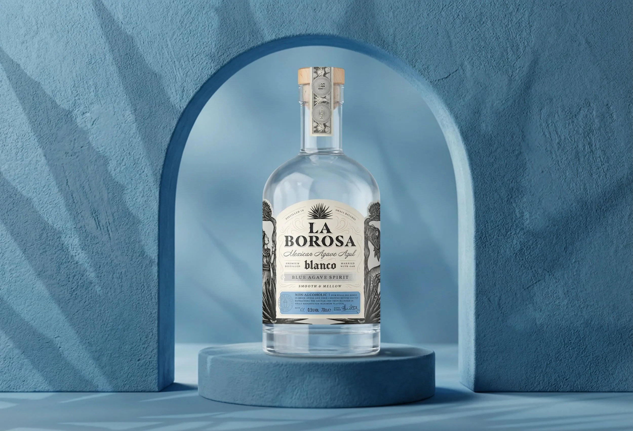
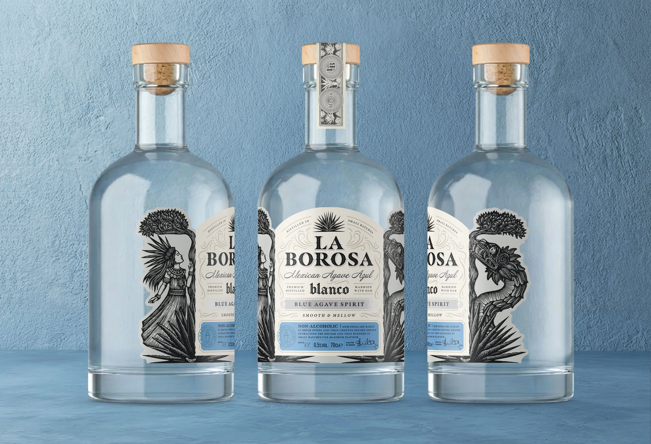
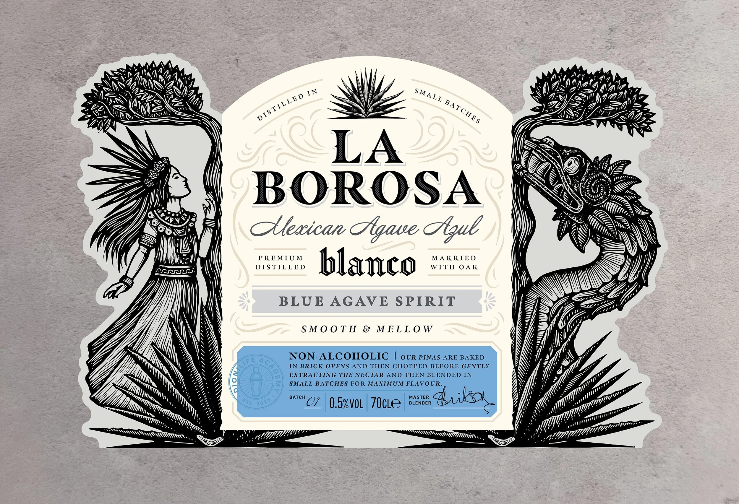
The brand is anchored in the story of Mayahuel, the Aztec goddess of agave. This mythology runs throughout the design. Linocut illustrations by Eduardo Robledo depict Mayahuel and Quetzalcoatl alongside the agave plant and the double-branched tree from their story. The linocut style introduces a raw, tactile quality that reflects the handcrafted nature of agave spirits and avoids an overly polished finish.
Design Execution
Clarity on shelf was a priority. Agave cues and familiar tequila references ensure the product reads quickly in a fast retail or bar environment.
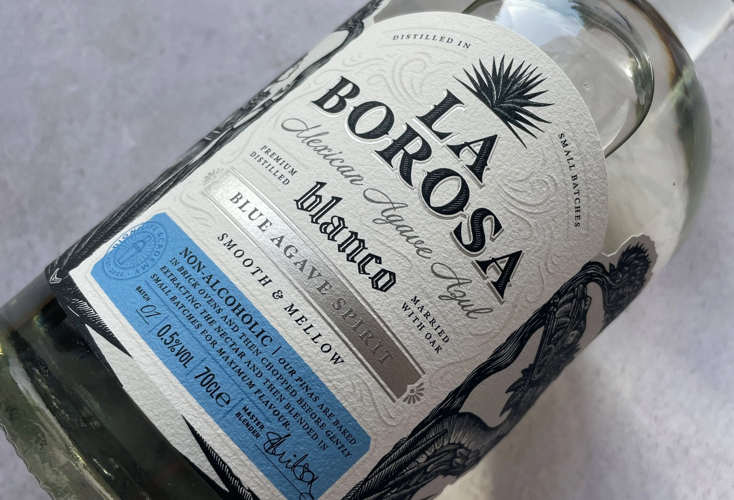
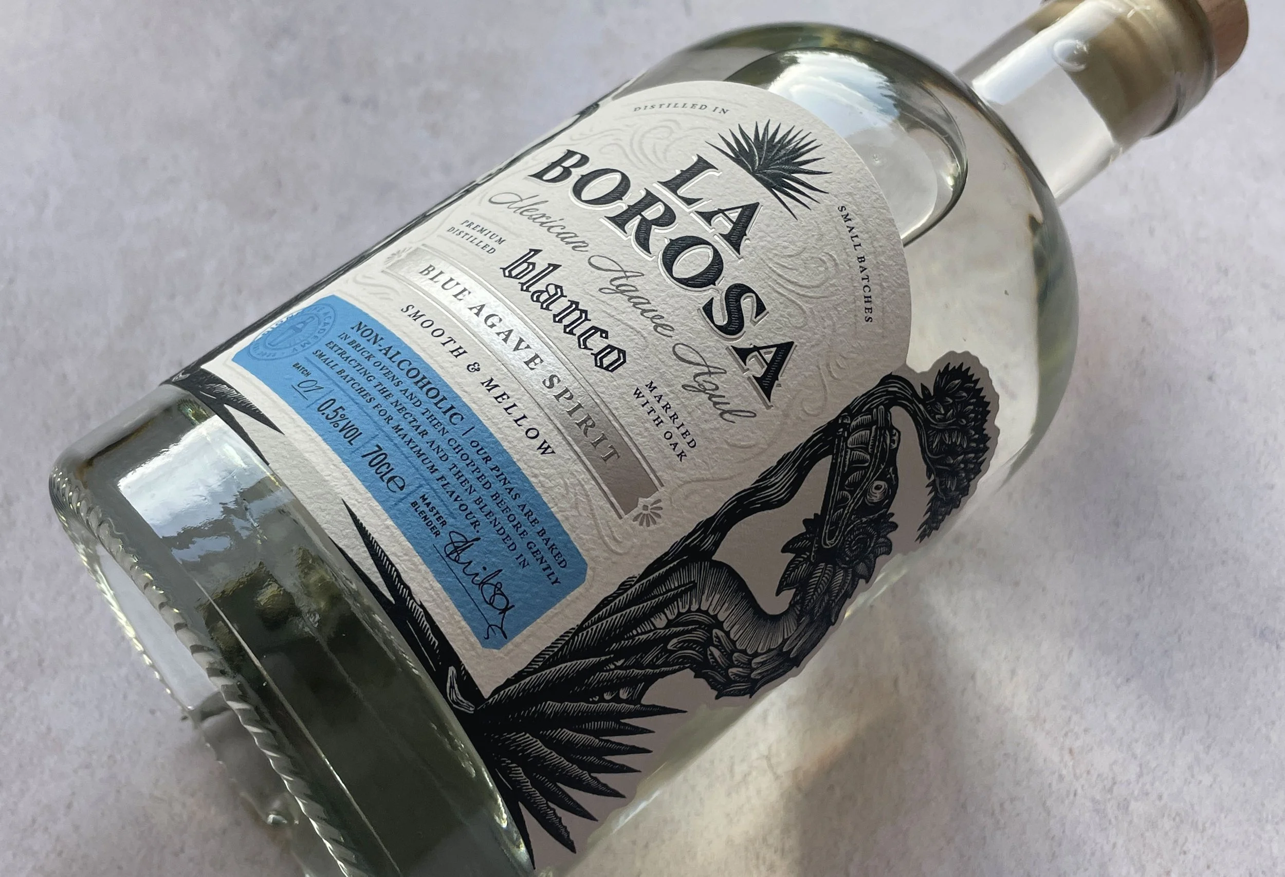
In hand, the experience becomes more layered. A heavyweight textured paper stock introduces tactility and a sense of craft, while embossing and foil detailing elevate the finish. A subtle swirling wind emboss moves across the label, referencing Quetzalcoatl and adding movement and depth.
The colour palette draws from blanco tequila cues, using white, silver and blue to signal familiarity and quality. Typography follows a similar logic, referencing the category to build credibility while maintaining a distinct voice. The packaging performs two roles at once. At a glance, it communicates clearly and anchors itself in the agave category. Up close, it reveals narrative, texture and detail.
Balancing these layers was key. Too much detail risks confusion, while too little can feel generic. The aim was to create something immediate, but more engaging the longer you spend with it.
Outcome
The result is a packaging system that feels aligned with both the liquid and the ambition behind it.
It communicates quality with clarity, builds credibility through familiar cues and introduces depth through storytelling and craft. It allows La Borosa to sit confidently alongside premium tequila and reframes expectations of what a non-alcoholic spirit can be.