
Behind the Design: Sip Studio x Pavari
How we created the packaging for Pavari, a premium non-alcoholic aperitif
In this behind-the-scenes look, we’re sharing how we took Pavari from concept to shelf. From initial strategy and research to moodboards, mockups, and final print-ready artwork, this is a glimpse into the creative process that turned a bold idea into a beautifully designed, premium product ready to go out into the world.
Packaging design for Pavari
The Brief - Premium. Distinctive. Full of flavour.
Pavari came to us with a clear and exciting challenge:
To create sophisticated, stylish, and premium packaging for a non-alcoholic aperitif that would be instantly recognisable as an aperitif, while carving out a visual identity all its own.
Key Requirements:
A visual identity that felt luxurious and tactile
A balance of familiar aperitif cues and a distinctive personality
Packaging that would signal flavour and quality, not abstinence
Discovery - Understanding the brand
We began by immersing ourselves in the world of Pavari.
Pavari is a carefully crafted blend of high-quality fruits, herbs, and roots from the sun-drenched hills of the Mediterranean. Designed for vibrant, social moments, it delivers a full-flavour experience rooted in tradition and taste.
In a category where many non-alcoholic brands lean into minimalism and free-from messaging, Pavari wanted to stand for something different: flavour, ritual, and richness.
We also deepened our understanding of the target audience:
Women aged 21–30
Urban, social, lifestyle-conscious
Interested in moderation but unwilling to compromise on taste or experience
This audience doesn’t want to feel like they’re missing out. They want drinks that feel elevated and complex whether they are alcoholic or non-alcoholic.

Discovery
Research - Diving into category and competitors
Next, we explored both the world of traditional alcoholic aperitifs and the growing category of non-alcoholic spirits to understand their visual languages, emotional cues, and brand behaviours. We considered where Pavari could sit, and how it could stand apart.
What we found
Alcoholic aperitifs feel rich in heritage. Their packaging leans into:
Vibrant colour palettes — bold reds and deep blues
Ornate typography — vintage fonts and stylised logotypes
Tactile finishes — from foil and embossing to luxurious paper stocks
Historical motifs — crests, emblems, and classic design elements
These brands celebrate provenance. They feel storied, confident, and culturally embedded.
In contrast, many non-alcoholic brands take a more minimalist route—stripping away emotion, choosing clinical, or wellness-led aesthetics. While clean and modern, these designs can lack the richness and ritual that define the aperitif experience.
The opportunity
We saw a space for Pavari to do something different:
Celebrate tradition without imitation
Lead with flavour and story, not just “what’s missing”
Bring the emotional depth of heritage spirits to the alcohol-free world

Research for Pavari
Visual Strategy - Building a world of flavour and escape
Our moodboards blended vintage Mediterranean references with 1920s Riviera glamour. We wanted the brand to feel like a small moment of escape. Of enjoying golden hour with a spritz in hand.
We pulled inspiration from vintage hotel branding, Art Deco posters, and the golden age of aperitivo culture, capturing the spirit of social sipping and slow living.
1920’s glamour meets modern luxury
Mediterranean heritage with a contemporary twist
A feeling of sun-drenched terraces, seaside escapes, and timeless sophistication

Chosen visual direction
Concepts - From vision to first designs
Using our moodboard as a guide, we developed concepts that brought Pavari’s story to life.
Peacock illustrations — a nod to vintage glamour and Mediterranean luxury
Retro fonts — to ground the brand in familiarity and category authenticity
Playful details — like stylised orange borders and illustrated aperitivo glasses to add personality and charm
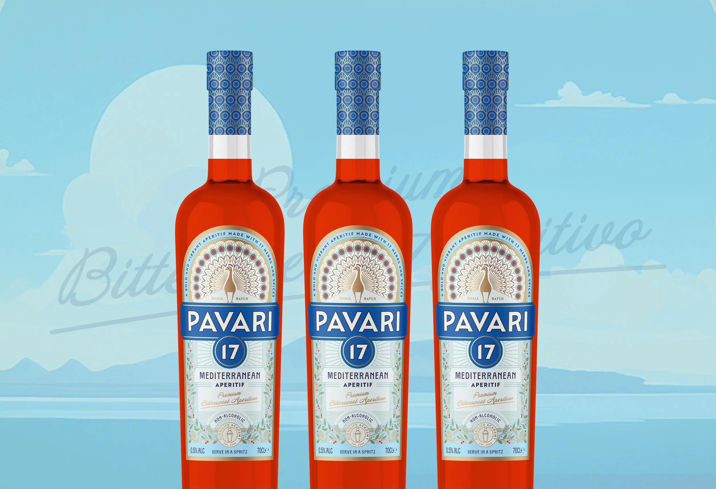
The peacock became a central symbol in the Pavari visual story. Chosen for its elegance, quiet confidence, and unmistakable sense of sophistication, it perfectly embodied the spirit of the brand.
It nods to the manicured gardens of the Italian Riviera, evoking a world of slow luxury, timeless beauty, and sun-dappled opulence.
Its inclusion brought a layer of storytelling and visual richness that tied the brand back to a place and era when aperitivo culture thrived, offering just the right amount of intrigue and charm.
We chose a colour palette of blue, orange and gold to add Mediterranean cues. Orange brings flavour, warmth, and brightness. Blue adds coolness, sophistication, and a sense of sea and sky. Together, they feel vibrant, stylish, and elevated — like summer in a bottle.
We struck a balance between nostalgia and modernity, ensuring Pavari would feel instantly at home in the aperitif space, while standing out from the crowd.

Chosen concept
Design Development - Refining the Details
With the concept chosen, we refined every detail to ensure it worked beautifully in print and on shelf.
Key refinements included:
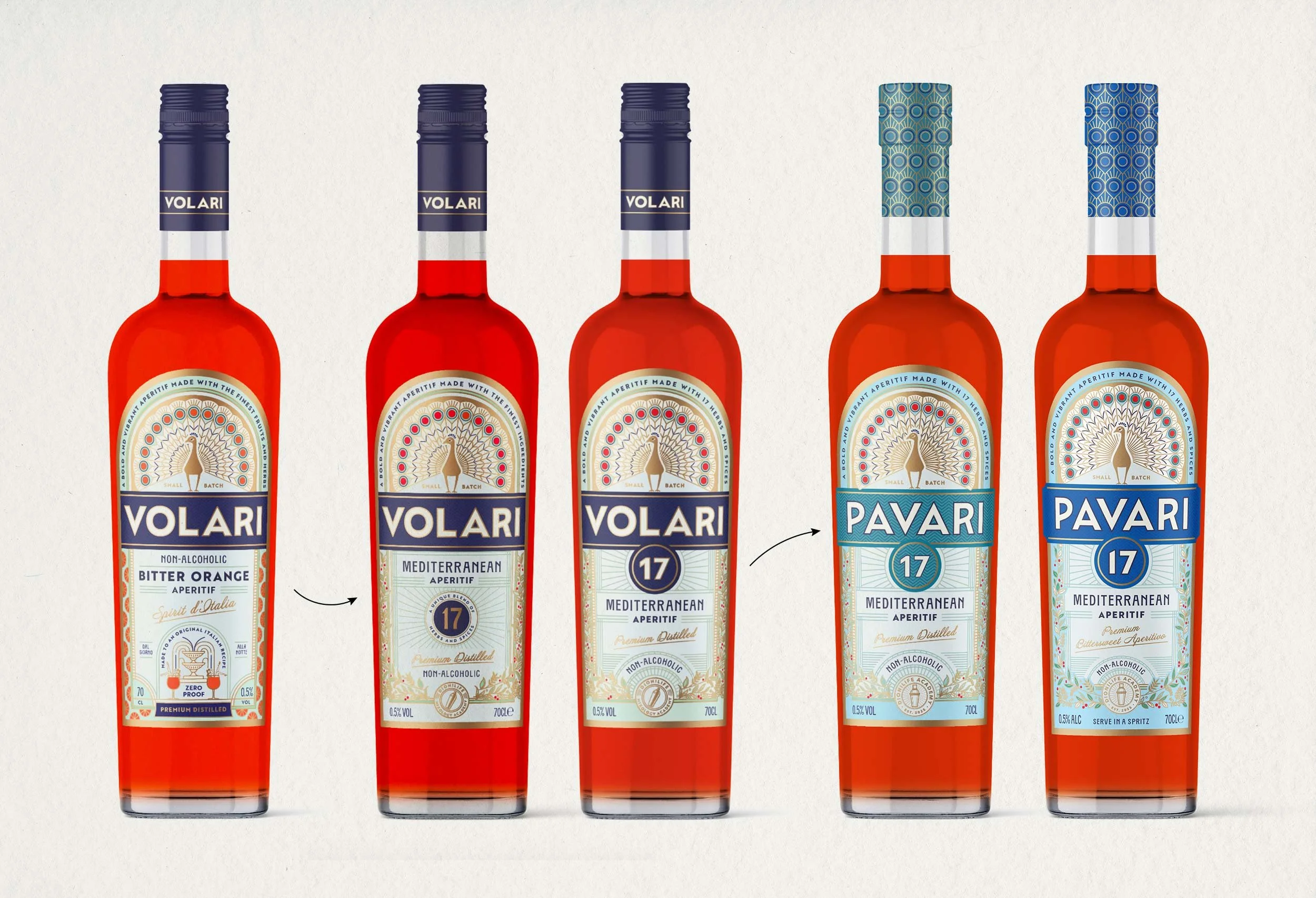
Name change from Volari to Pavari
Adding “17” to highlight the number of fruits, herbs, and spices in the recipe
Changing from “Bitter Orange” to “Mediterranean Aperitif” to better capture the drink’s flavour profile
Adding a botanical illustration to add flavour cues and reflect the ingredients
Finalising bottle choice and switching to a cork closure to enhance the ritual of pouring
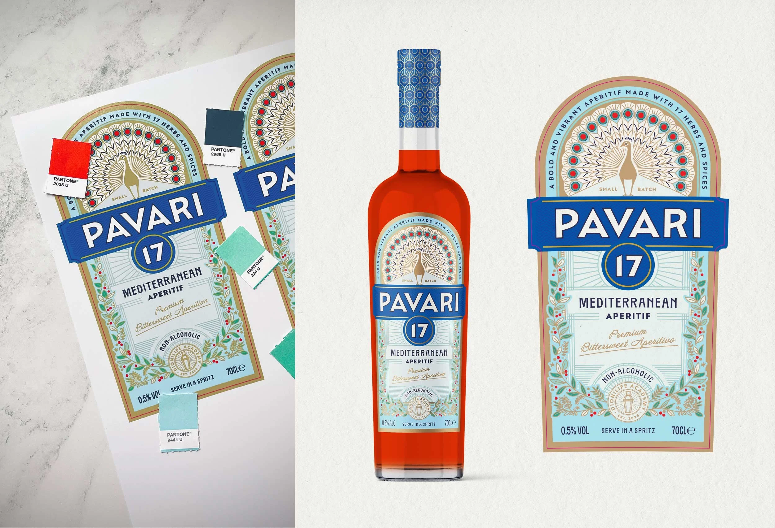
We meticulously adjusted colour tones, resized and repositioned label elements, tested mockups, and selected paper stocks and finishes that enhanced tactility and shelf appeal.
Design development
Artwork - Bringing the design to life
With final design approved, we moved into production.
We prepared print-ready artwork for both UK and US markets
Liaised directly with printers to align on finishes, foiling, and embossing
Created colour proofs to ensure colour consistency matched our vision
From digital file to physical label, every stage was carefully managed to ensure every detail met the standard of excellence we envisioned for the brand.
Creating the print-ready artwork
A Design Process Rooted in Purpose
Throughout every step we focused on bringing the story of Pavari to life.
Pavari’s packaging is not just about looking good on shelf.
It’s about:
Signalling premium flavour and quality
Evoking the ritual and romance of aperitivo moments
Creating a unique identity in a growing, competitive space
Whether you’re sipping on a sunlit terrace or gathering with friends after work, Pavari brings elegance to the everyday.
Looking to create packaging that captures your brand’s full flavour?
Let’s bring your next idea to life, from concept to shelf.